

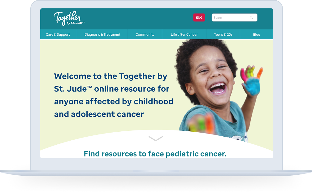
St. Jude Children's Research HospitalRedesigning a Global Health Resource for St. Jude Children's Research Hospital
❋ Project ContextTogether by St. Jude is a global, multilingual online resource created by St. Jude Children’s Research Hospital for families facing childhood and adolescent cancer, blood disorders, and other serious conditions. It offers trusted medical information, supportive care content, and shared stories of hope to patients and caregivers around the world, regardless of where they receive treatment.
❋ My RoleI led the project from strategy through execution, shaping the site architecture, messaging flow, visual direction, and final design implementation. This included UX/UI design, content strategy, feature planning, and hands-on website execution to ensure the final experience matched both the brand and the business need.
2021 Digital Health Awards
〰️
2021 Digital Health Awards 〰️
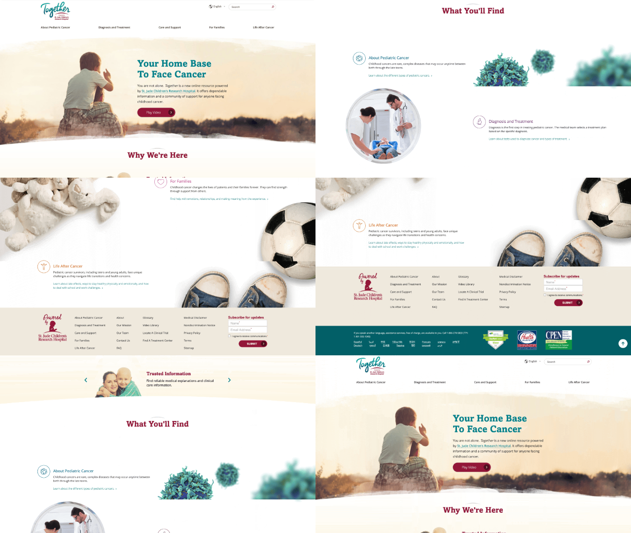
Old Website
Expressable Speech TherapyThe Challenge
Designing a global patient education platform that could hold dense, evolving medical information and make it feel clear and navigable for families facing childhood cancer and other serious illnesses. Together serves patients, caregivers, and survivors from many countries, cultures, and literacy levels, which meant the site needed to work equally well for a parent reading on a mobile phone in a hospital room, a clinician sharing a resource in clinic, and a teenager trying to understand their diagnosis on their own.
Existing content was rich but often hard to scan: long articles, complex terminology, and deeply emotional topics competing for attention on the same page. The web experience needed stronger hierarchy, clearer pathways through information, and layouts that could support multiple languages without becoming visually overwhelming or confusing. At the same time, every design decision had to respect strict health literacy guidelines and clinical review processes: no oversimplifying or dramatizing the content just to make it “feel lighter.”
The team needed a way to structure Together’s content into a calm, guided experience: one that surfaces the right information at the right time, helps different types of visitors find what they need quickly, and makes the site feel like a reliable companion rather than another source of anxiety. That meant rethinking page structure, navigation, visuals, and microcopy so the platform could scale globally while staying empathetic, accurate, and easy to use.
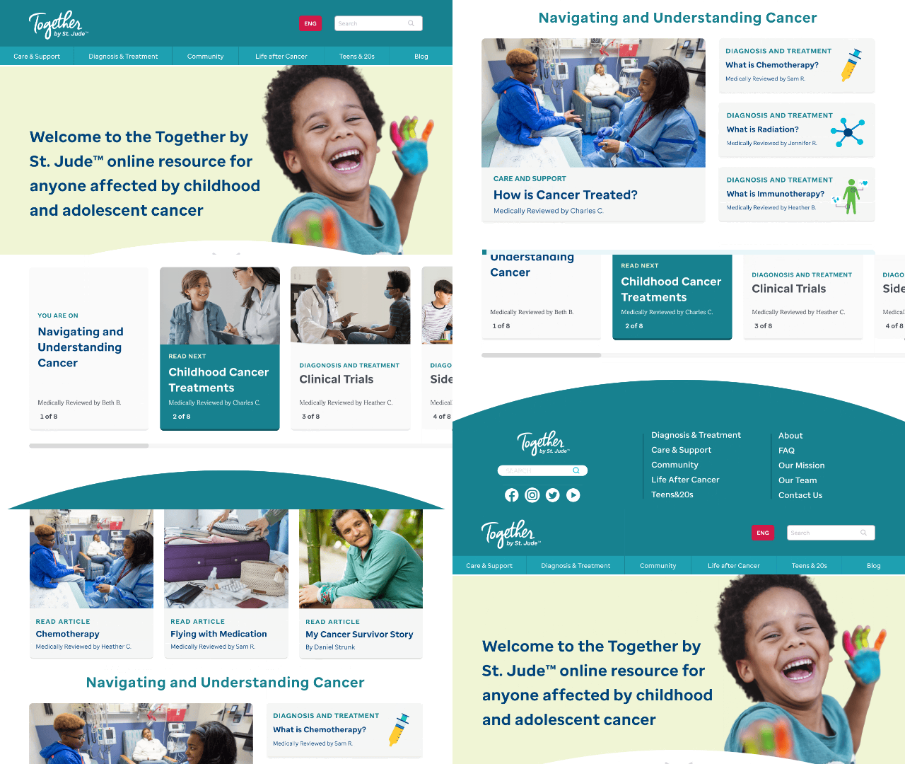
Wireframe
Expressable Speech TherapyApproach
My approach began with research and strategy, analyzing leading health platforms to understand how they structure complex medical data while maintaining accessibility and calm for families. I then applied health literacy principles so medical resources on Together were presented in language, layouts, and hierarchies that felt digestible for parents, caregivers, and young patients.
Through a UX/UI audit, I identified friction points in the existing navigation that made it difficult for users to find critical support resources quickly, especially across different diagnoses and care stages. By adhering to St. Jude’s brand guidelines, I translated these findings into new components and intuitive navigation paths that help patients and families locate specific treatment information with minimal clicks.
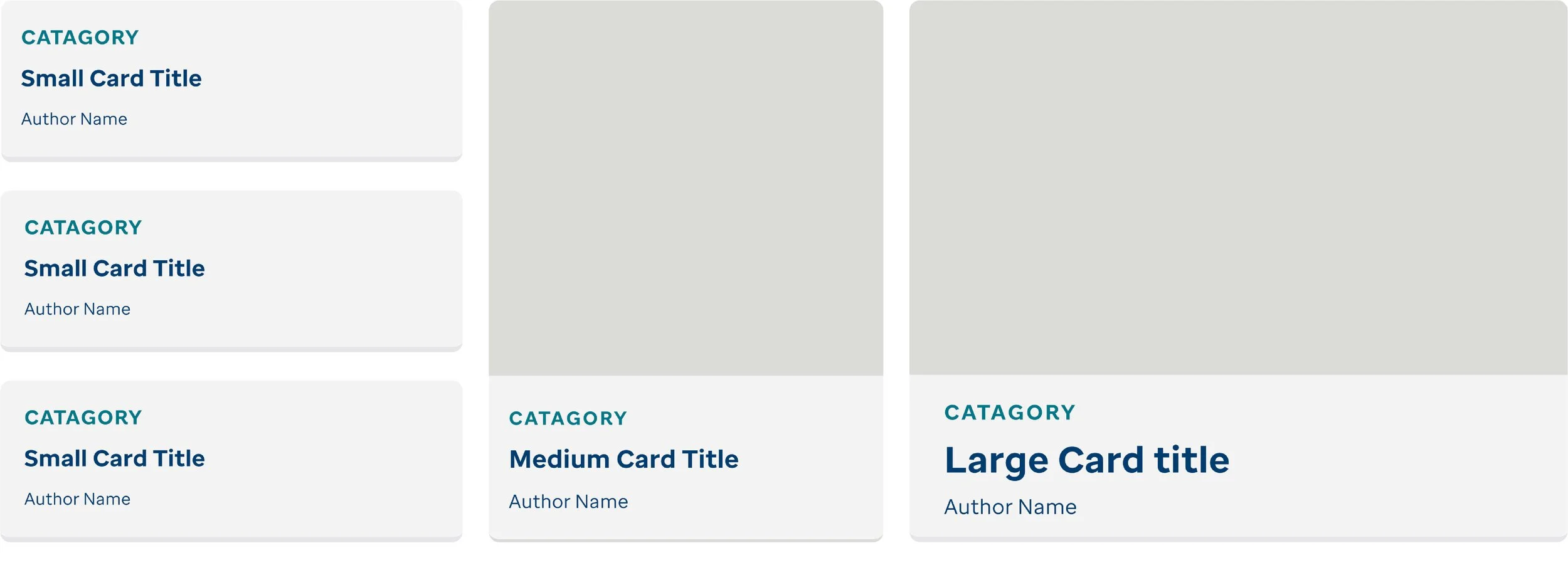
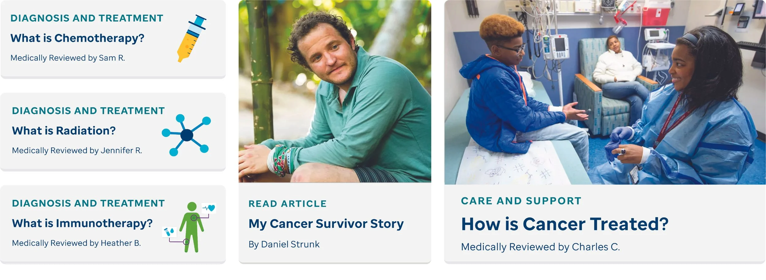
example of small, medium, and large card component sizes.
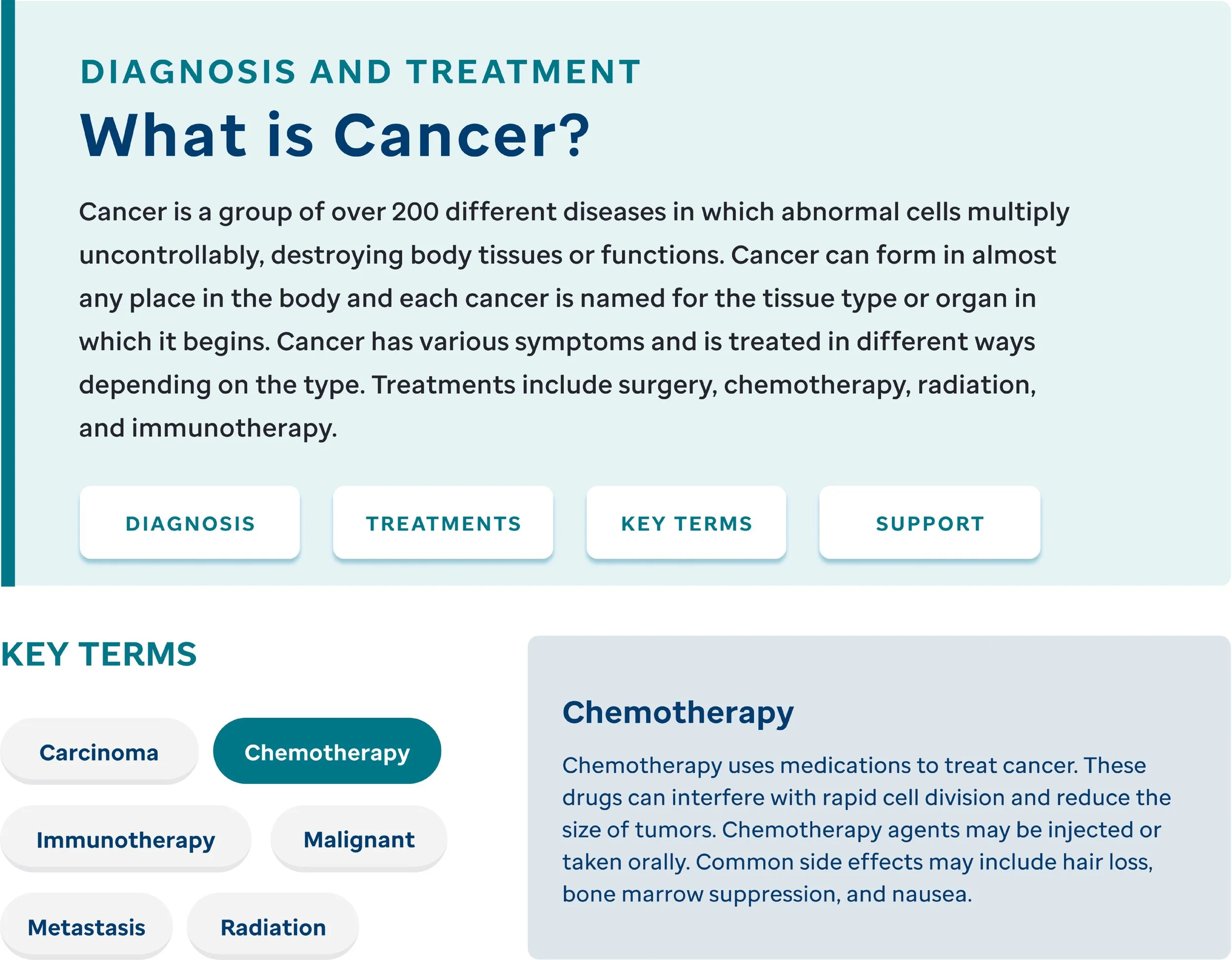
example card components with content.

Selection of St. Jude’s New Spot Illustrations