

Memphis Farmers Market Memphis Farmers Market: Brand Refresh and Boosting Donor Clarity & Revenue
❋ Project ContextMemphis Farmers Market is a weekly, non‑profit outdoor marketplace in downtown Memphis that showcases locally sourced produce, prepared foods, and artisan goods from regional vendors. The organization relies on clear communication to connect shoppers, vendors, and donors—and needed design that felt as vibrant and local as the market itself while still supporting its fundraising and community education goals.
❋ My RoleI served as a one‑person creative partner for the market, leading brand and visual direction, graphic design, illustration, merchandise design, and promotional strategy. This meant building a cohesive visual language that could show up across posters, social graphics, signage, and donor‑facing materials while staying true to the community‑driven feel of the market.
Memphis Farmers MarketThe Challenge
The market’s materials were doing a lot at once—promoting events, explaining vendor information, and trying to speak to donors—without a cohesive visual system or clear messaging hierarchy. As a result, shoppers and vendors could find basic information, but donors struggled to understand where their money was going, what the market’s impact actually was, and how to support it in a meaningful way.
The challenge was to create a design and communication system that could honor the personality of a busy, colorful, local market while giving donors and partners a more focused, confident story about the organization’s mission and impact.
Approach
I started by clarifying what each audience- shoppers, vendors, and donors needed to understand most quickly, then mapped the key messages and touchpoints across the season. From there, I developed a visual system inspired by the colors, produce, and textures of the market itself, using illustration and bold typography to keep materials instantly recognizable and easy to read.
For donor‑facing pieces, I shifted the emphasis from event promotion to impact storytelling: simplifying copy, highlighting where funds go, and creating clearer calls to action so supporters could see how their contributions sustain the market and the local food ecosystem. Merchandise and collateral extended this system in a way that reinforced the brand in the community while opening up additional revenue opportunities.
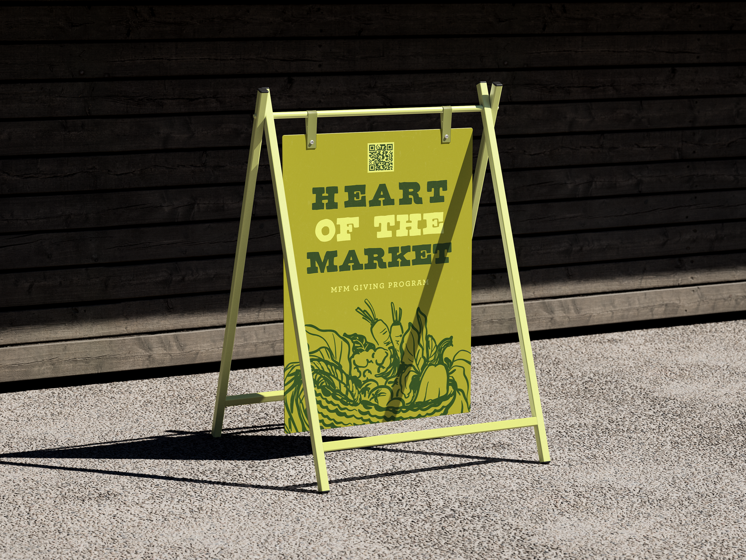
To eliminate donor ambiguity, I developed the visual language for The Heart of the Market Giving Program using a clean, easily digestible tiered structure to outline how philanthropic contributions supported specific market initiatives.
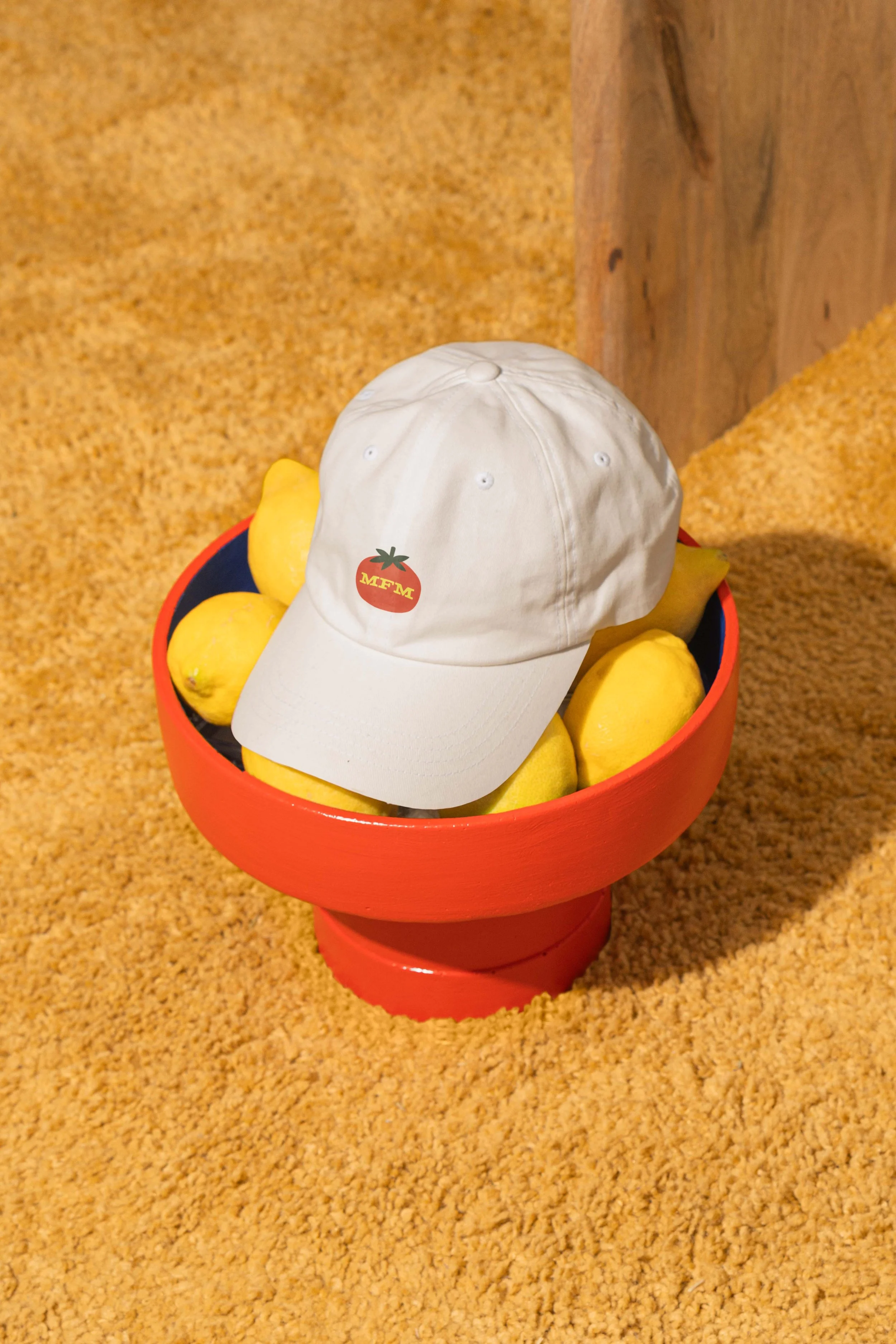
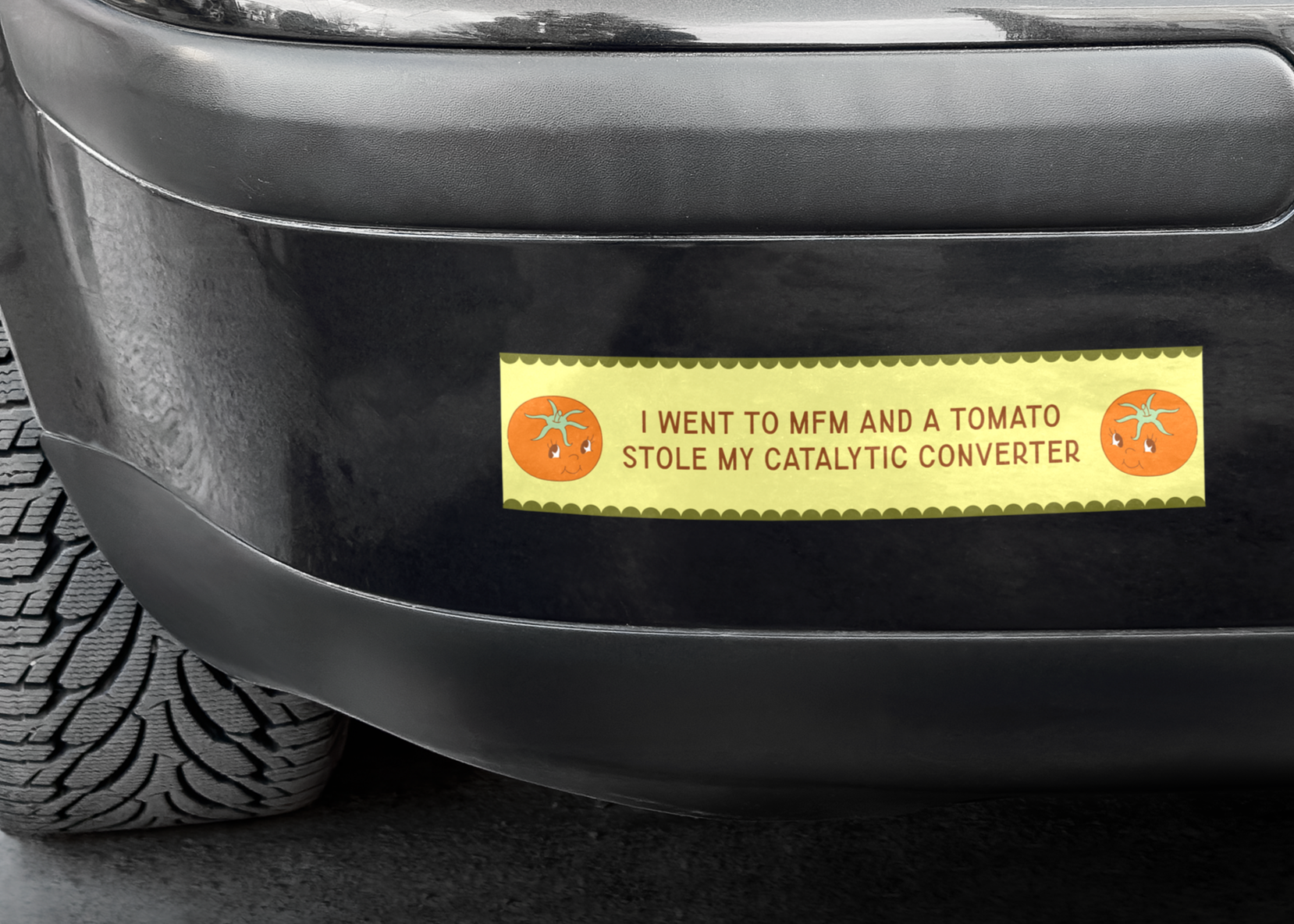
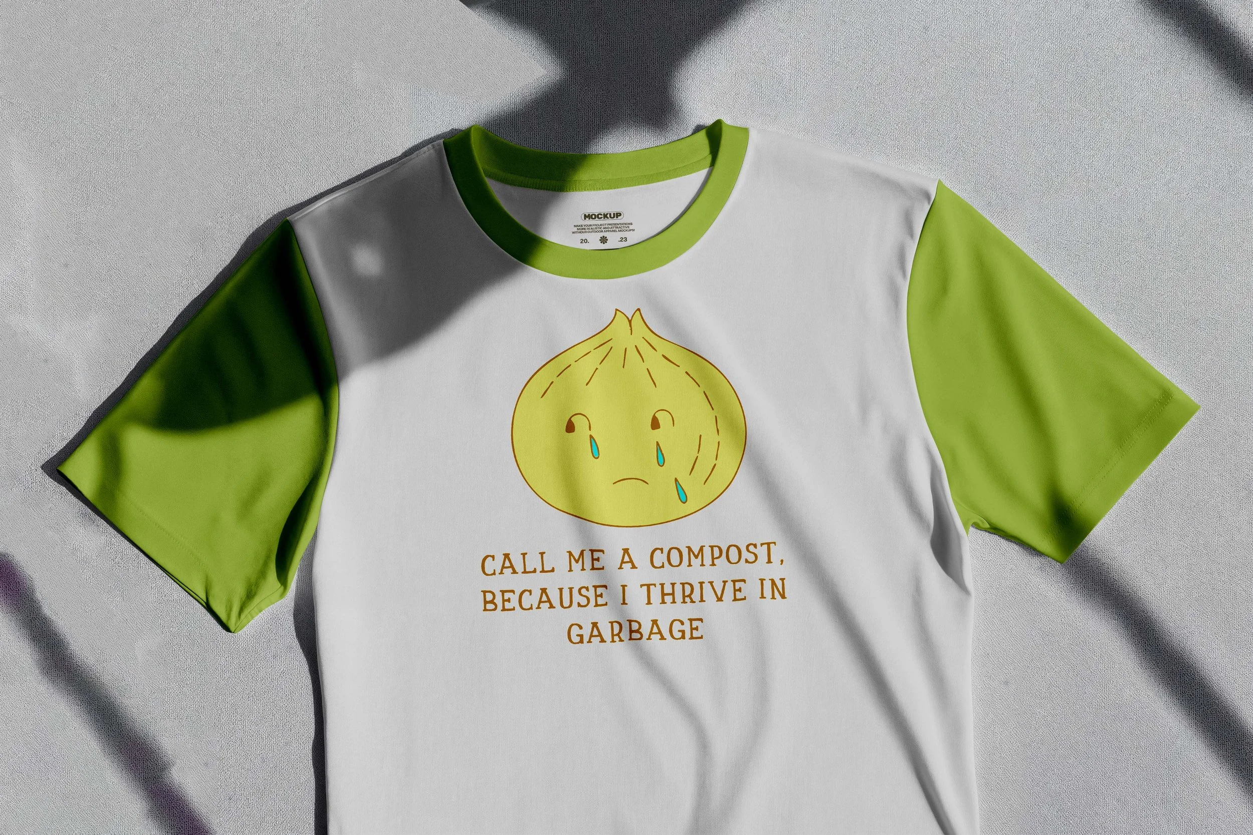
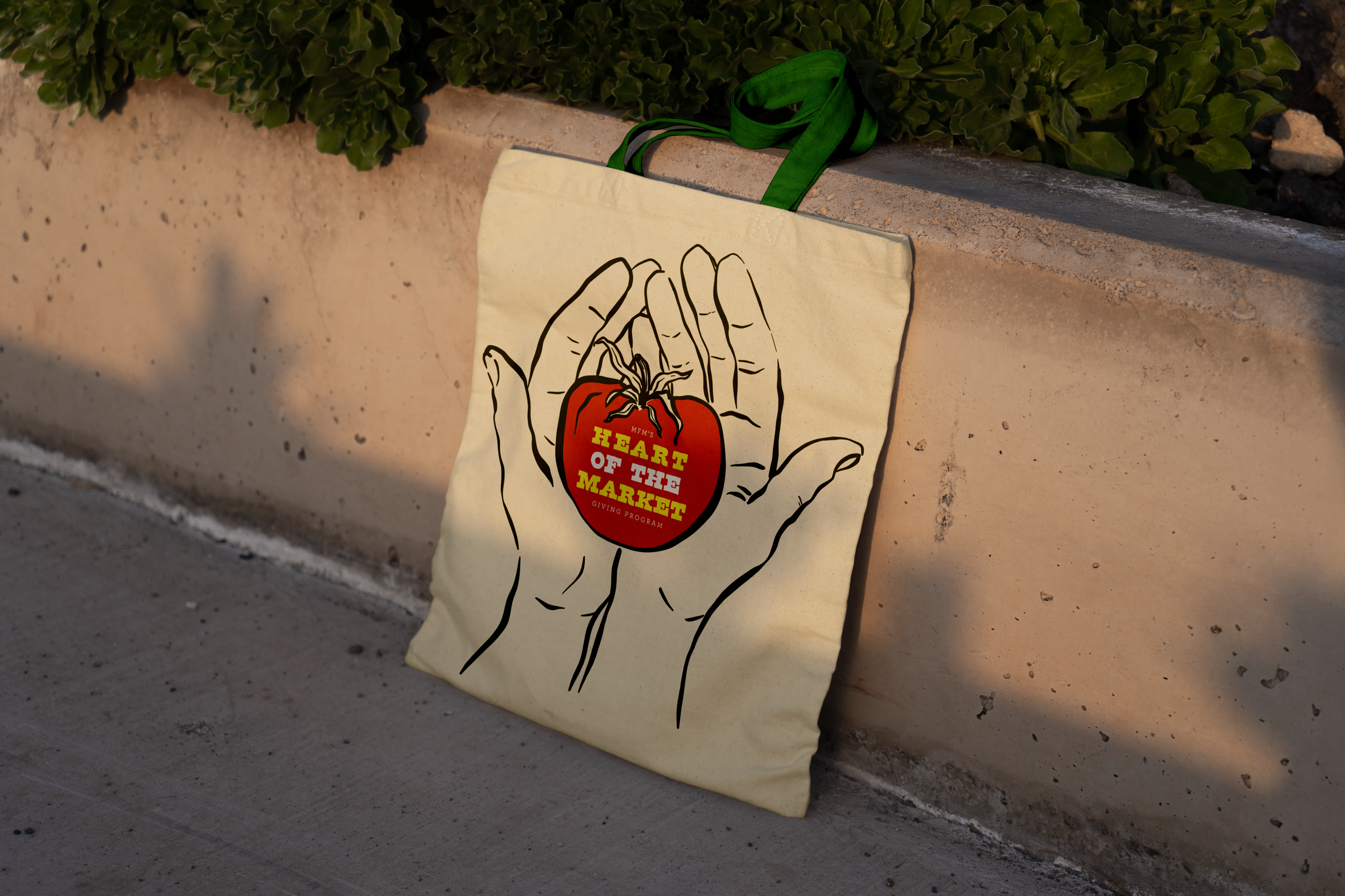
High-quality merchandise design provided an additional revenue stream while strengthening the market’s visibility within the neighborhood.
Refreshed logos
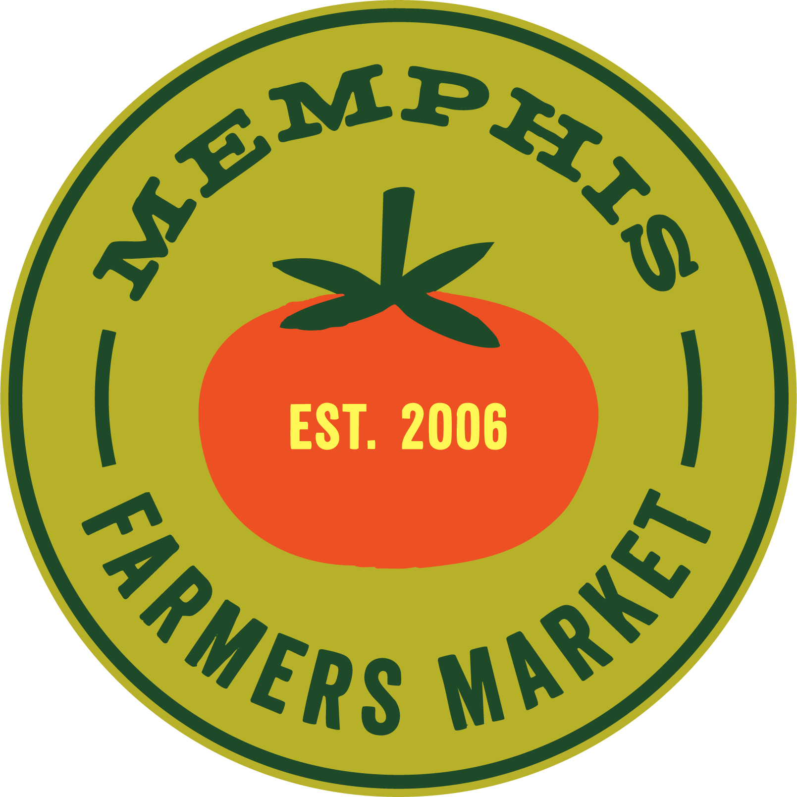
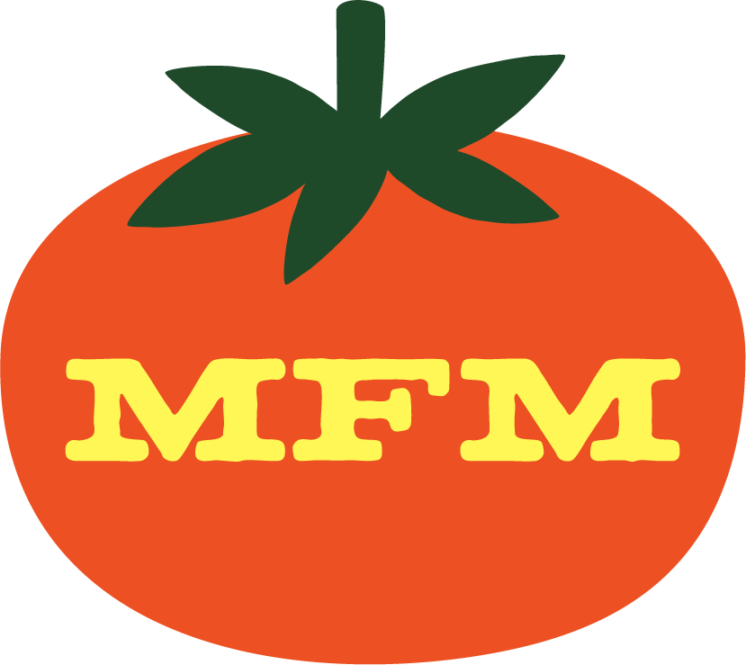
With a refreshed website hero and digital experience, I helped bridge the gap between the Market’s historic roots and its modern audience for deeper community engagement through cohesive storytelling.