Wiseacre Brewing Co.Transforming a Static Site into a High-Utility Brand Experience
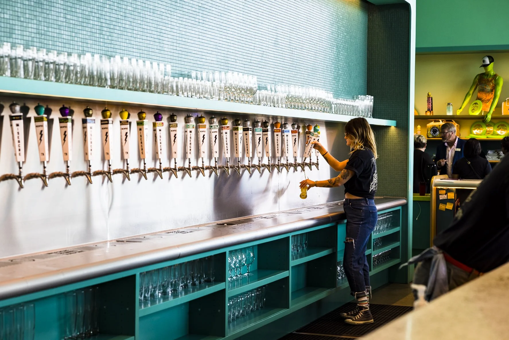
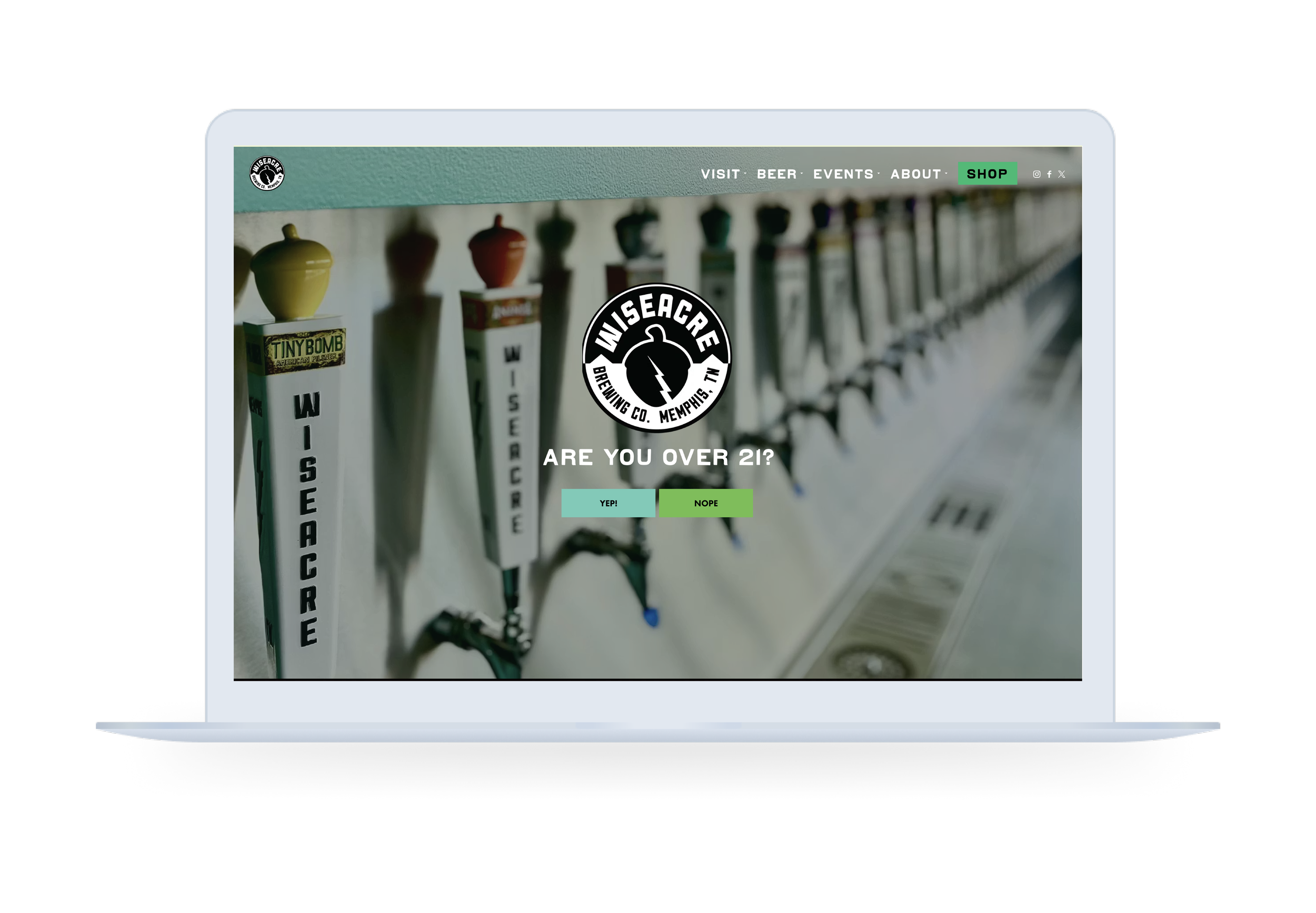
❋ Project ContextWiseacre Brewing Company is known for its bold branding, storytelling, and strong taproom presence. However, its existing website functioned primarily as a static landing page, lacking the depth and utility needed to support customers looking for product information, events, or direct engagement with the brand.
❋ My RoleI led the redesign from strategy through execution, defining the site architecture, guiding the visual system, and identifying high-impact features that would improve usability, support internal workflows, and create clearer paths to conversion.
Increasing Sessions by 206.4%
〰️
Custom BevFinder
〰️
Scaling Annual Active Users from 38k to 118K
〰️
Increasing Sessions by 206.4% 〰️ Custom BevFinder 〰️ Scaling Annual Active Users from 38k to 118K 〰️
Wiseacre Brewing Co.The Challenge
The previous site made it difficult for users to find essential information such as taproom hours, beer availability, and upcoming events. Visually, heavy use of patterns and color created noise that competed with content. Functionally, the absence of key features limited both user engagement and operational efficiency.
The redesign needed to balance expressive brand identity with clarity, while introducing tools that support real user needs and business goals.
BEFORE
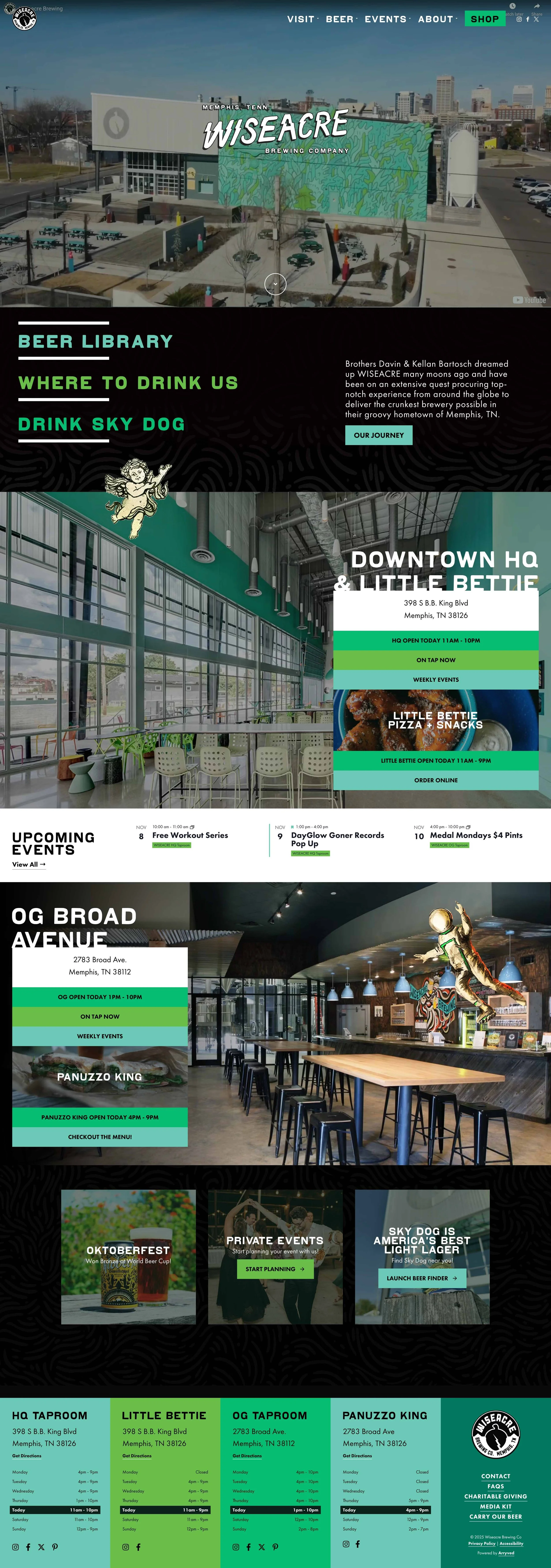
AFTER
Wiseacre Brewing Co.Approach
Reframing the site as a utility-driven platform: I shifted the site’s role from a static brand presence to a functional resource. This meant prioritizing features that allow users to take action—whether that’s finding a beer, planning a visit, or placing an order—while ensuring those pathways are intuitive and accessible.
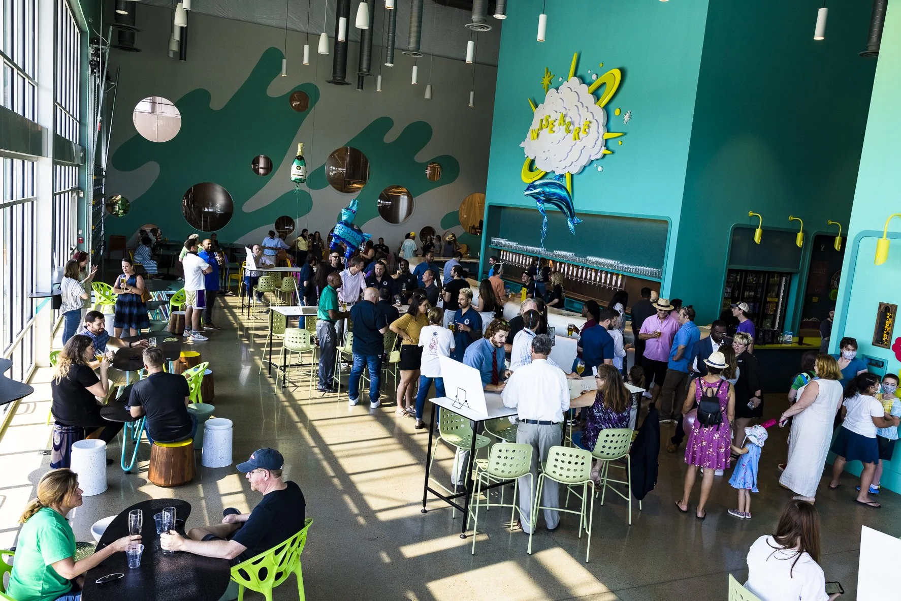
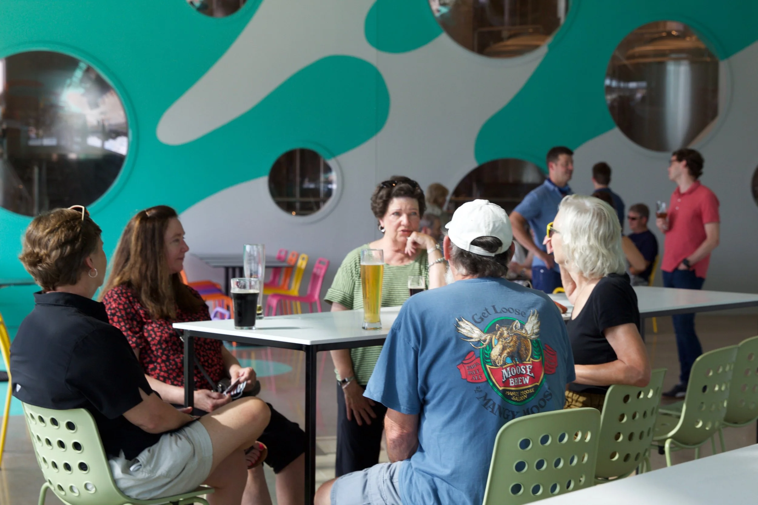
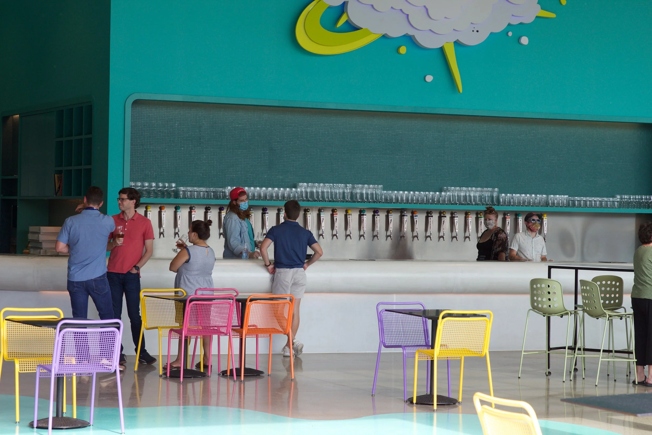
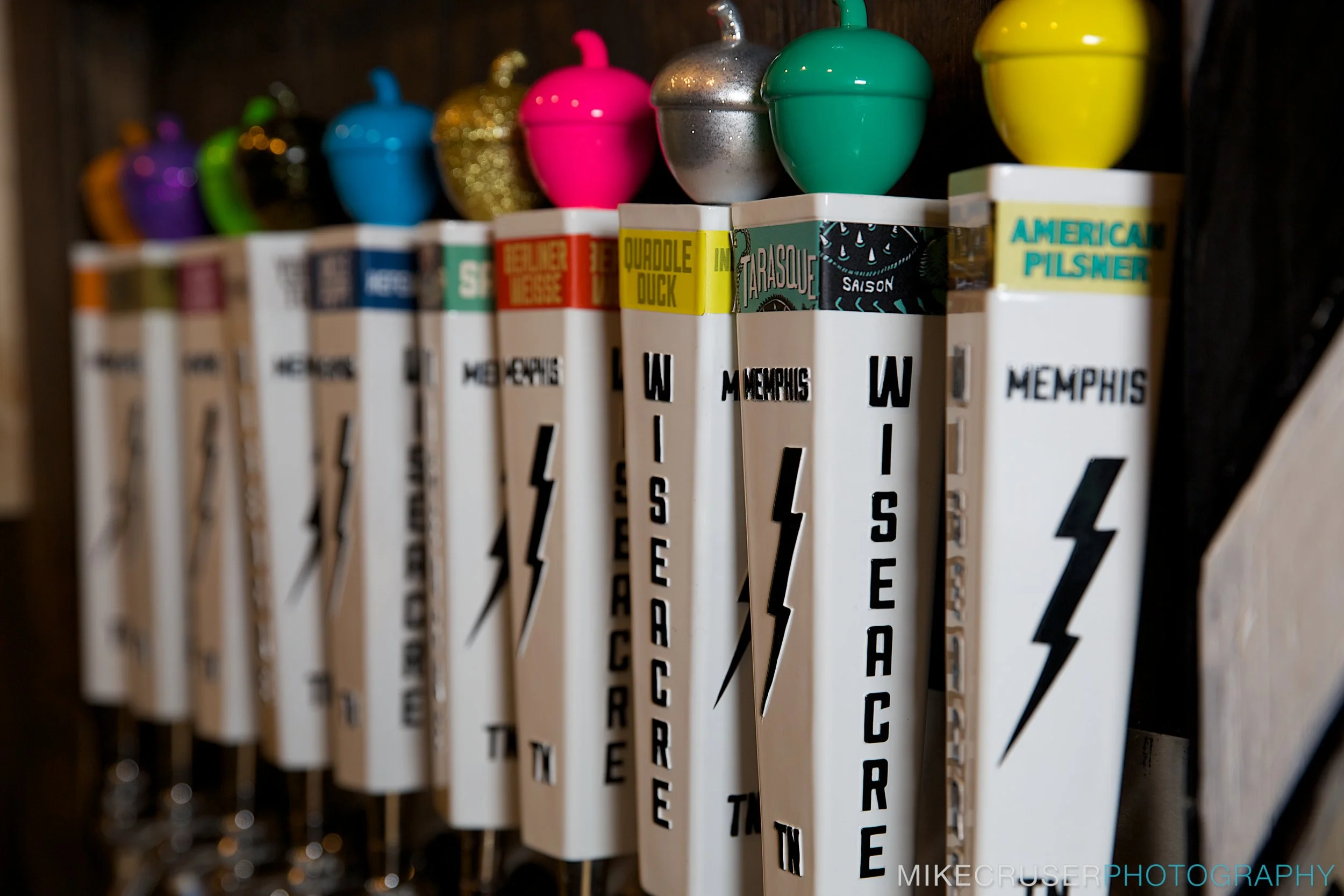
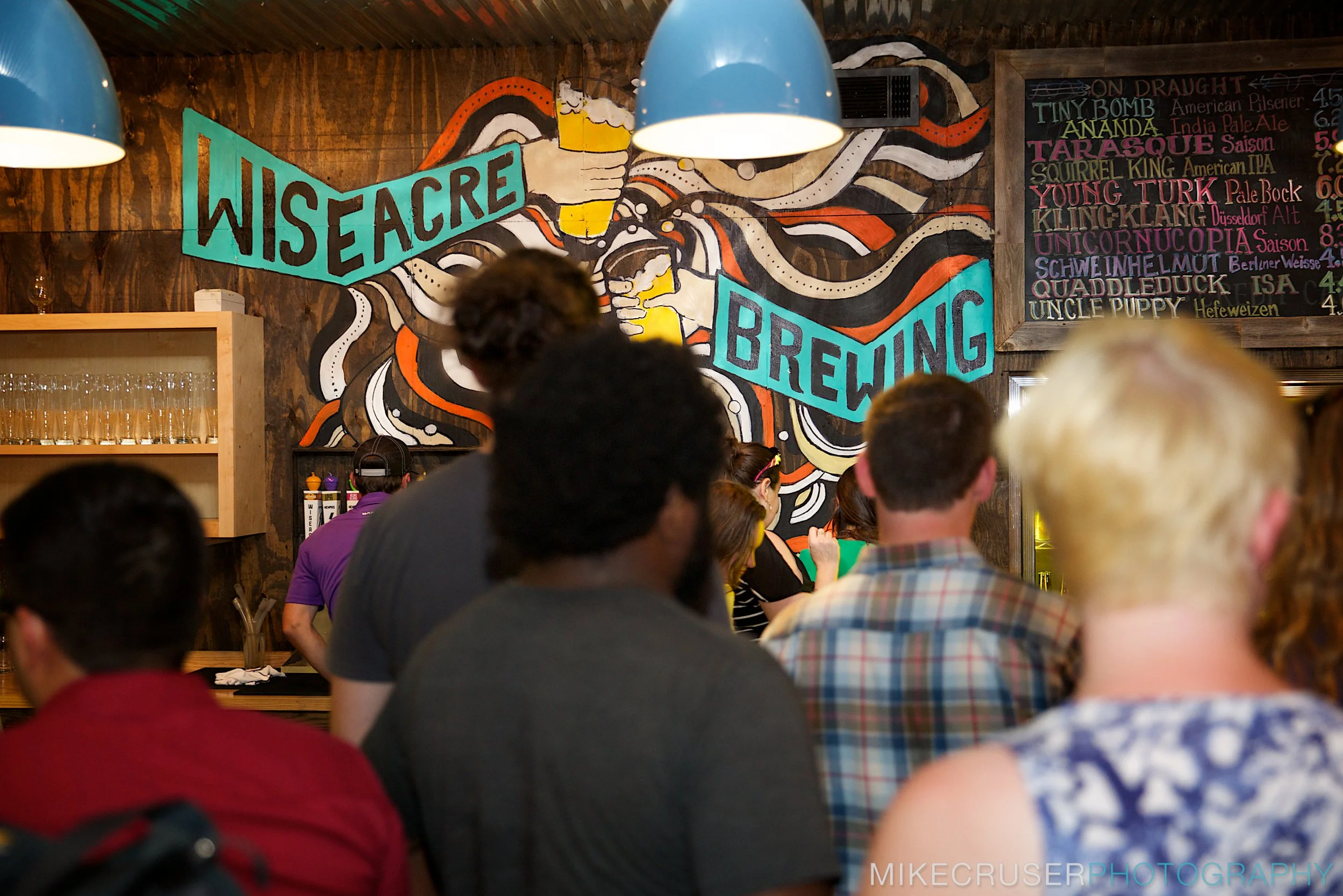
Simplifying the visual system to support content: The original site’s heavy patterns and saturated color palette were refined into tonal variations and a more restrained color system. Inspired by the taproom mural, this approach preserved brand personality while introducing negative space and improving content hierarchy.
Making key information persistent and accessible: To address discoverability issues, I redesigned the footer and introduced taproom hours and event modules across the homepage and subpages. This ensures users can quickly access critical information regardless of where they enter the site.
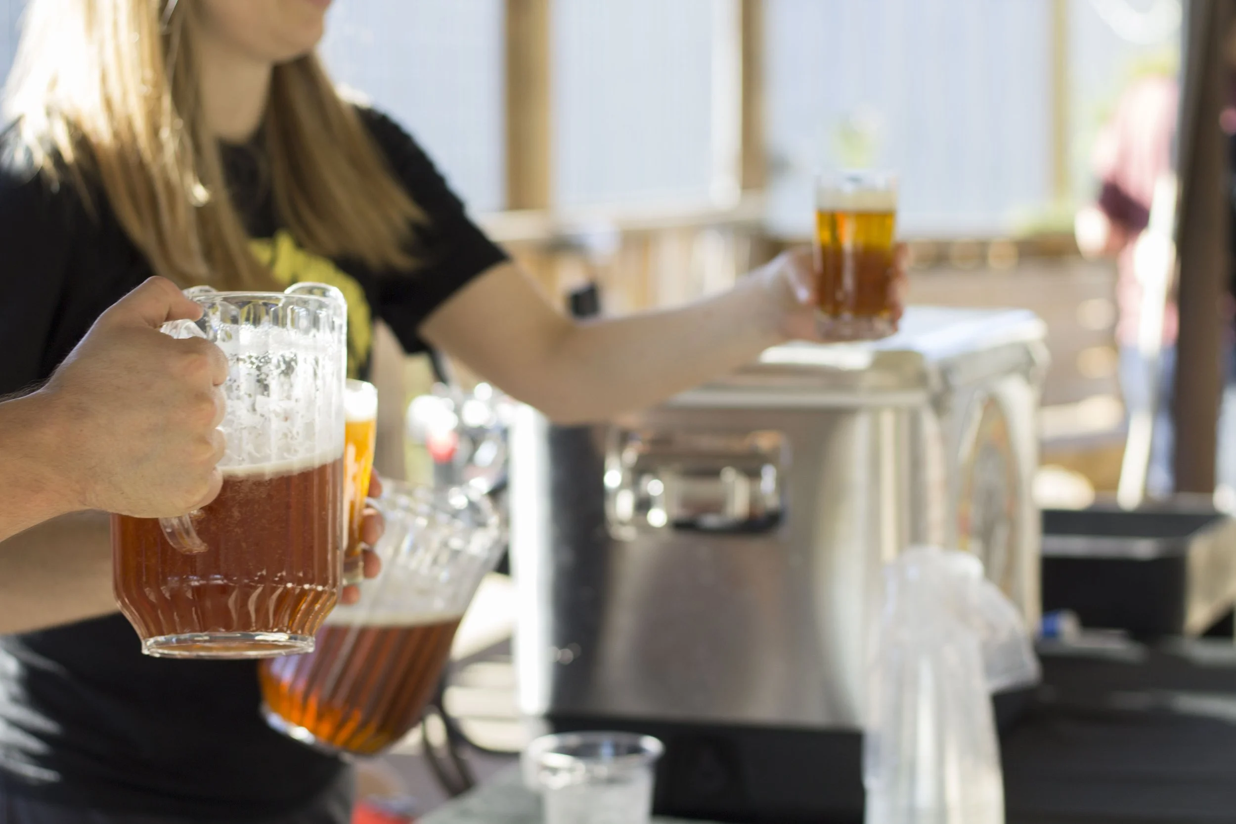
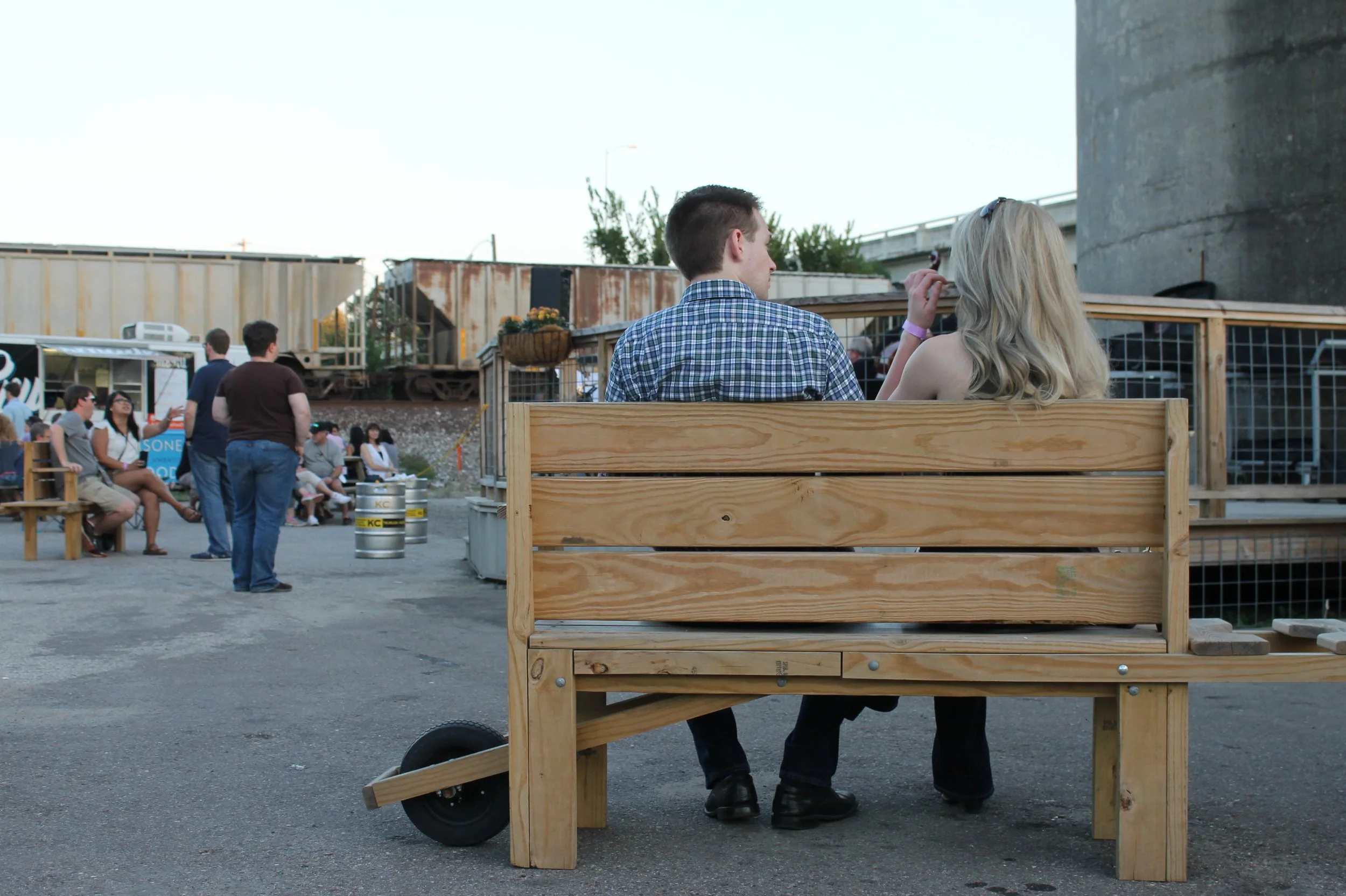
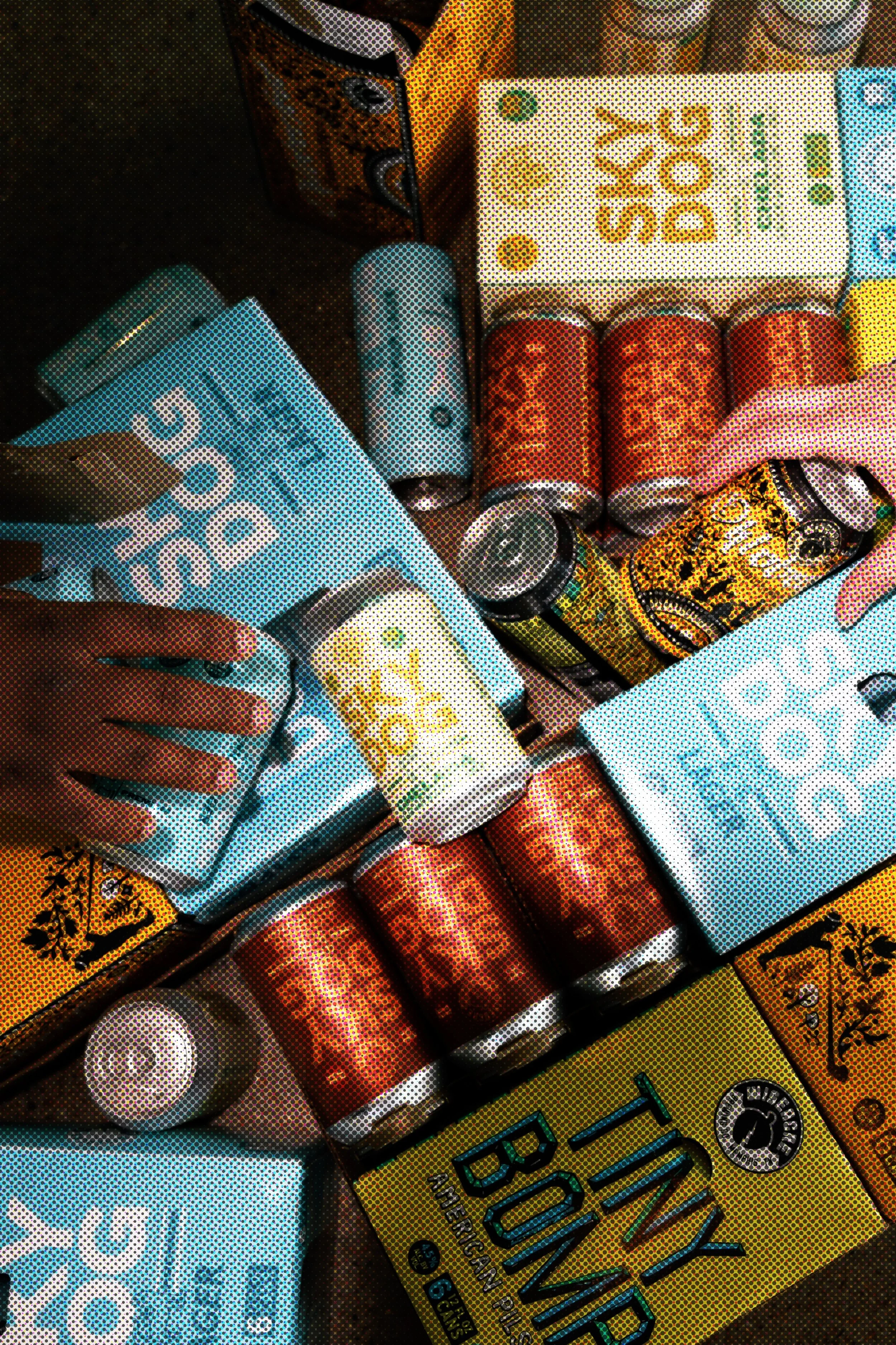
Building a structured content and image library: I audited over 13 years of photography to create a curated, high-quality image system that accurately reflects each taproom and product. This established visual consistency and strengthened brand storytelling across the site.
Introducing high-impact features to drive engagement:The redesign focused on adding tools that directly support user needs and business operations:
❋ Live taproom menus with real-time updates❋ Searchable beer library with filters and product details❋ Zip-code-based beverage finder❋ Centralized events calendar for tours, classes, and taproom events❋ Private events page tailored by location❋ Contact hub supporting inquiries, careers, keg requests, delivery, and FAQs❋ Enhanced e-commerce experience and newsletter integration